I've opened the PESU Academy app almost every morning for years. Attendance before class. Timetable between lectures. Grades after results. It was the backbone of student life — but broken PDFs, irrelevant notifications, and confusing navigation had become something everyone simply accepted. Nobody was happy with it. They were just used to it.
So I decided to do something about it.
Self-initiated project. Research, survey design, UX and UI design, and prototyping, all me.
Figma
Google Forms (Survey)
GPT,Claude.
This wasn't just one bad screen. The app had:
Outdated UI
A visual language that hadn't kept up with the apps students use every day.
Irrelevant notifications
Students were getting alerts that had nothing to do with their branch or courses.
Missing functionality
Some things students needed were available on the website, but not inside the app.
Confusing navigation
Finding basic information wasn't as straightforward as it should have been.
And this mattered because 67% of students opened the app every single day. The problem wasn't that students hated the app. They had simply learned to work around it.
I ran a survey across my batch and collected 57 responses. The feedback confirmed that the problems weren't just mine.
Four things stood out:
26%
Wanted course content accessible inside the app.
12%
Wanted notifications relevant to their branch and courses.
51%
Rated finding information and UI as only "Neutral".
82%
Had felt frustrated with the home screen at some point.
Some of the problems weren't really design problems. They were missing features, broken workflows, or things students simply couldn't do in the app.
I treated those as part of the redesign too, not just things to make prettier.
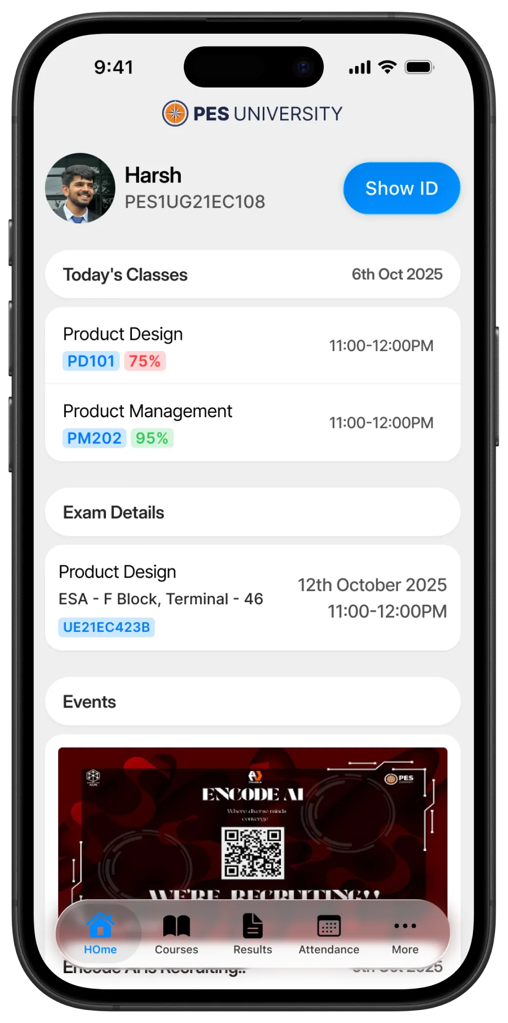
The home screen should answer that question immediately. So I surfaced the things students check most:
Next classes
Attendance
Timings
Student ID
Exams
Decisions Taken
Students sometimes forget their ID and get stopped at the gate. One ShowID tap keeps it accessible. Two upcoming classes remove the anxiety of what's next, while showing time and attendance instantly. Exam details often arrive last-minute. Showing time, subject, and seat number upfront removes the stress of finding them when exams are near.
The survey gave me the problems to solve, but the app also simply felt outdated. I rebuilt the visual system with a cleaner, more familiar interface that could feel at home alongside the products students use every day.
Same university. A completely different experience.
As a student and daily user, I already knew where the experience fell short. The 57 responses helped validate those frustrations and showed me where the redesign could make the biggest difference.
The goal was simple: don't design around what the app currently does. Design around what students actually need to do.
Local Time